
What 10 books have made an impression on your creative practice, as a printmaker and earth pigment artist? (ok, I couldn't stick to just 10!)
- Su France
- Mar 7
- 9 min read
Treasured Creative Book Companions- from colour choices, to ceramics, collagraphs and creating textiles and a few other themes in between.

You know that moment when someone asks about your favourite books, and your mind goes blank – despite having a shelf (or library or two) groaning under their weight?
Recently, as I caught myself staring at my overflowing bookshelf, I realised something: so many of these volumes have become silent guardians of wisdom, patiently waiting to be rediscovered.
Can you really have too many books that spark creativity? I don't think so! But you can certainly forget the gems of knowledge hidden within.
That's why I've decided to embark on a re-aquainting journey, through my library, dusting off each book jacket, then sharing a single valuable insight, from each book that have shaped my artistic practice.
Consider this my archive of creative inspiration – a curated tour through the books that have left an indelible mark on my work and thinking. I'll be updating this collection from time to time with other books, exploring what makes each one special and the key messages that have stuck with me long after turning the last page.
Exploring the Creative Bookshelf: Art, Colour & Creativity
So, here's a curated selection of books that span various aspects of printmaking, with a special focus on collagraph techniques, textile making, earth pigments, interiors, nature and other related topics.

1) Soft Minimal- A sensory Approach to Architecture and Design
This book dives into the art of creating spaces that feel both simple and deeply inviting. It’s all about stripping back the excess, while focusing on textures, light, and materials that engage the senses- the sort of look I aspire to for our home, but perhaps with a little more clutter!
The book explores how to design environments that are calming yet rich in detail, blending functionality with a warm, human touch. It's what I hope my prints and textiles do.
I enjoyed the quote about wood below, being 'patient and adaptable ...and speaking ...'of time and of transience.


"Soft Minimal" demonstrates that design goes beyond aesthetics—it encompasses how a space affects your emotions, how light interacts with surfaces, and how silence can possess beauty. It's that idea of a space evoking peace and intentionality. Taking time to reflect on the art I create and collect, and contemplating how it makes me feel, is a worthwhile practice that helps me connect more deeply with both my creative work and our living space.


2) Into The Light Of Things: Rebecca Salter
Rebecca Salter's book unveils the layers of how she feels we see art, revealing magic in everyday light and shadow.
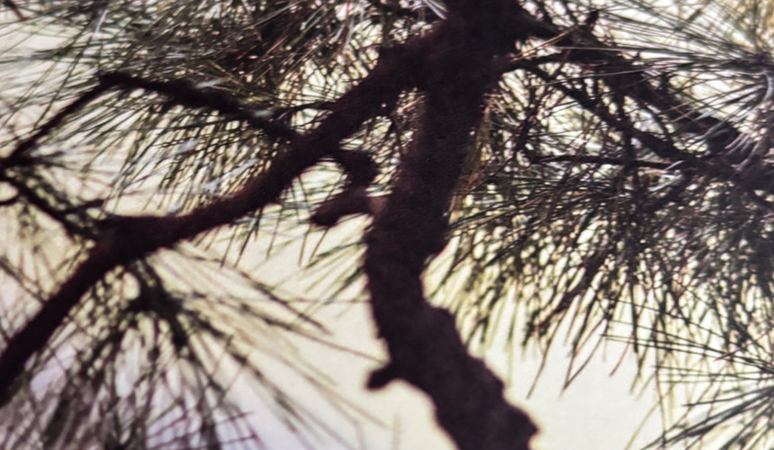
For example, she takes a beam of sunlight and turns it into a exploration of visual experience, giving us permission to pause, look at the world around us, finding beauty in unexpected places. As someone who takes multiple photos of shadows, notices raindrops on seed heads and loves the texture of weathered, rustic elm, I feel her words really resonate.


Her own approach to art isn't loud, but whispers with intricate, subtle textures and luminous depths.
You may experience what I did if you are drawn to minimalist, reductive works and feel a sense of calm, then find yourself drawn into a complex visual landscape that seems to shift and invites slow observation - the kind where you notice something new each time you look, creating a sense of quiet discovery. Can you tell I love her work!
I own another book about her work, Rebecaa Salter, Hirschi Contemporary Art- and one quote states
'To appreciate the complexities of her work takes time, and a certain state of mind. You can only sense her paintings fully if you are not scrutinising them, but let them infiltrate your body and mind, rather like ghosts. Only then can you start to feel your way through the surface, into the depths created by up to 40 layers of paint.'
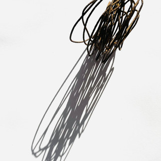
To the left you can see how own my love of shadows shows itself.

3) Capture the Quiet: A Seasonal Journal: Gemma McKell
This a calming, nature-inspired journal filled with thoughtful prompts and lovely illustrations. It’s designed to help you pause, reflect, and find joy in the little moments, as the seasons change.
A thoughtful gift from a dear friend, it has become a book I have dipped into to deepen my connection to the world around me, reminding me to pause and savour simple joys
It's at times a nostalgic read, with for example tips about photographing the sea and foraging or appreciate the gifts of the season. The photos of winter are beautiful and I wish we saw the quilts of snow as long as she obviously does.

4) Collagraph Printmaking: Donald Stoltenberg
I found an absolute treasure on eBay - an old, tattered, yet brilliant guide to collagraph printmaking, that's become well thumbed reference for this fascinating technique.
It walks you through how to create textured printing plates, using everyday materials like cardboard, fabric, and found objects, all explained with the kind of practical detail that comes from real studio experience.
It arrived when my own practice was more advanced that that of a complete beginner, but there was still ideas new to me.
Stoltenberg, an American printmaker, is known for his innovatiion in depicting architectural subjects, particularly cityscapes and industrial scenes. Many remind me of the North East of England, where I grew up. His pioneering methods while developing a distinctive style also have abstract and representational elements, something I embraced more myself as my work evolved.


He uses silk organza as the primary surface on many of his plates and I will soon be trying bamboo silk as a more sustainable alternative.
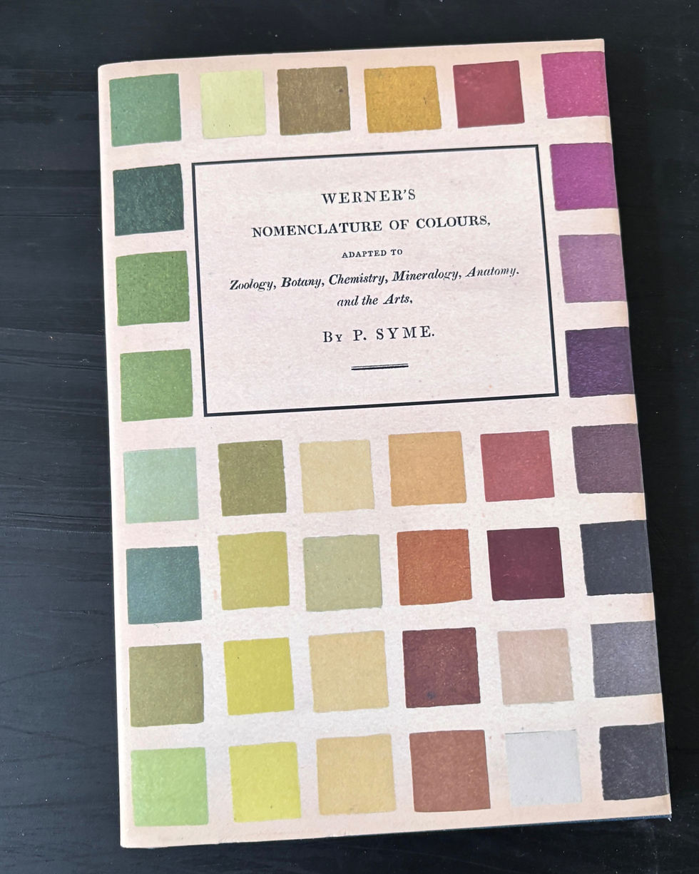

5) Werner's Nomenclature of Colours: P. Syme
Published in 1814, and bought for me by my sister in law, as a birthday present, this fascinating colour guide did something revolutionary at the time- it matched specific colours to examples found in nature, from minerals to flowers, to bird feathers.
I was thrilled to get a copy of this reprint, especially since the original served as Charles Darwin's colour reference during his voyage on the Beagle. What makes it so special is how it bridges art and science, showing us that precise colour description isn't just about mixing pigments - it's about really seeing the world around us.
I enjoy the handwritten charts which illustrate where colours are found on animals, vegetables and minerals eg chestnut brown- neck and breast of red grouse, chestnuts (who knew!) and Egyptian Jasper- (our old cat's name- just the Jasper part! Ask me some time about why he stole potatoes!)
For a while I named my own mixed colours in the same way, with things they reminded me of in nature. The book to the left on colour mixing, although it doesn't count as one of my 10, it has sometimes come in handy for colour mising

6) Found And Ground: Caroline Ross
This is more of a book that I dip into, and when I first bought it, I couldn't help but see potential pigments in so may places – for example that red iron infused- silt in the stream, on a walk we discovered when we joined the Lincolnshire Wildlife Trust and explored our local area in new way.
Ross writes with such genuine enthusiasm that it's impossible not to catch her excitement for this ancient craft.
What I love most is how she demystifies the whole process – you thankfully don't need fancy equipment or chemicals and there's something deeply satisfying about grinding a piece of ochre you found on a hike in Argyll, while visiting a friend, then watching it transform into a warm, earthy paint that carries the story of its place. Much better than a shop bought souvenir!
The photos in the book are stunning – a documentation of her process, showing the subtle variations that natural pigments offer. She seems to say 'Let's go outside and make something beautiful together and I know the adage 'don't judge a book by its cover', but
in this case I think we should all be able to - inviting earthy colours, promoting a grounding, meaningful read!

7) Make Ink: A Forager’s Guide to Natural Inkmaking: Jason Logan
This is one of those books that feels like a conversation with a deeply passionate and slightly eccentric friend. Some of my best mates fit that mold and I hope that I am in that category too.
Logan’s enthusiasm for turning rusty nails, (I have a stash too) wild berries, (easy to come by here, although our Dutch friend warns not to eat those from 1m down as it's where the foxes mark territory) and even street debris into beautiful, sustainable inks is contagious.
Reading it made me see the world differently—I started noticing colours and textures everywhere, wondering what kind of ink they might make. It’s not just a guide, it’s an invitation to get curious. Who knew the diversity of colour from different walnut trees!


You have probably realised by now that I adore pots- and in particular bowls, simple, textural, simply shaped. They repeatedly appear in my work and thanks to an understanding husband who loves them too, they populate surfaces in our house. Some are functional, some simply beautiful and some help me recall special people or times.

8) Earth & Fire: Kylie & Tiffany Johnson
When I came across this book what really resonated was their emphasis on developing a relationship with each place you gather from, taking only what you need, and giving something back. Their step-by-step instructions for processing and purifying raw earth has obvious links to my earth pigment work. It is less like a manual and more like a conversation with two passionate artists who are sharing their life's work. I may not have been the intended audience for this coffee table book, as I don't make pots (other than the paper mache variety), and haven't since 'A' level art, but it didn't stop me gaining lots from it. I particularly enjoyed the form and texture of the pots celebrated within.


The sisters, who wrote Earth & Fire encourage developing a palette that genuinely reflects your local landscape, fostering a deeper connection between your art and your environment.
It reminded me of my own site specific collecting, and some of these pigments can be seen on the right, in test tubes from when I took them to the Great Northern Contemporary Craft Fair
9) Lucie Rie: The Adventure of Pottery
Having Lucie Rie's The Adventure of Pottery on my shelf simply brings me joy. The book's stunning photographs capture the elegance of her ceramic forms—pieces I could never afford to own, and I’m not sure I’d want the responsibility of having one, even if I could.
The book beautifully documents her revolutionary work, from delicate, thin-walled bowls with flared rims, to experiments with volcanic glazes and sgraffito techniques. I love the precision of scratchy line marks.
Pages reveal her balance of function and artistry, with close-ups of subtle textures, pinched edges, and her iconic bronze-rimmed vessels as you see on the front cover. While I may never hold an authentic Lucy Rie piece, this collection lets me study and admire her gorgeous work, letting the 3D shapes influence my own 2D ones.

10a) Expressive Printmaking: Mary Dalton
What resonated most, was Dalton's philosophy that truely expressive print comes from embracing imperfection and unexpected results. She challenges the notion that printmaking must be precise, instead encouraging me to develop an intuitive relationship with my materials and processes.
Creating many quick plates in an hour using only found objects – pushed me into loosening up on perfectionism, to discover fresh visual language.

10b) Kintsugi: The Poetic Mind: Bonnie Kemske
After my hysterectomy, as I healed, I rediscovered kintsugi—the art of repairing broken pottery with gold.
This book spoke to me because it finds beauty in flaws and celebrates resilience. It felt like a perfect reflection of my own journey, showing how broken pieces can be made whole again, and even more beautiful.
It’s not about claiming elements of another's culture, but appreciating its wisdom and applying it to my own life.
Art and healing are universal, and kintsugi’s message of resilience speaks to everyone.

What makes this book particularly interesting is how Kemske connects traditional kintsugi to contemporary art practices. I enjoyed reading how more modern artists have adapted its principles in innovative ways, applying them to different materials and artistic expressions beyond ceramics.
Kemske's book opened my eyes to possibilities beyond traditional application, encouraging me to translate kintsugi's principles into my own print designs, with real 24 ct gold leaf and vintage Japanese thread.

10c) The Teabowl - East and West: Bonnie Kemske
Another book by Bonnie Kemske. This book showed me I should examine asymmetry in traditional tea bowls, an aesthetic principle to inspire unique approaches when creating texture in collagraph plates. It also made me want to observe how glaze flows and pools in tea bowls, as similar principles can be applied when working with printing inks on textured plates. By embracing imperfection in my printmaking, some interesting effects came from unplanned texture interactions.
The Art of Collagraph: Mary Ann Wenniger
I got this one from the library yonks ago and am still looking for an affordable second hand copy, so please let me know if you see one!
A few more books from my bookshelf. If you want to see these and a few more, leave a comment and I'll write another blog.


Comments